
Benjamin Moore has announced their 2012 pick for color of the year...it's Wythe Blue (HC-143)

I adore this color. It's such a beautiful, calming hue. I would love this color in my dining room (stop back next week when I reveal my home goals for 2012...this is up on my list).
How about you - are you loving this color as much as me?
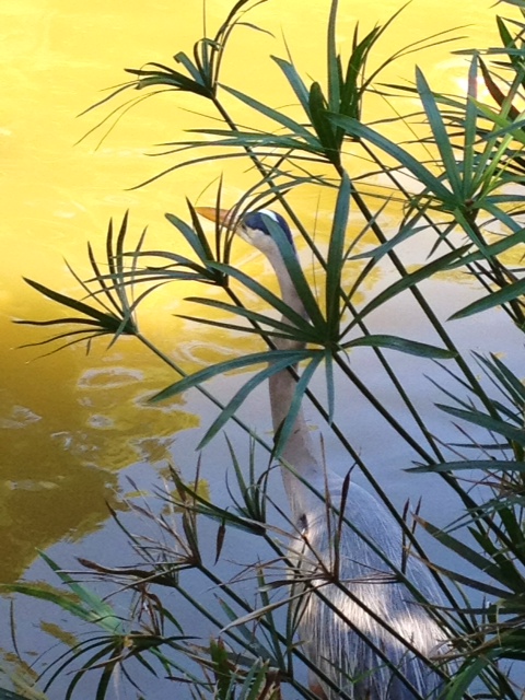
On a separate note...this photo was taken by my friend while she was on vacation on her iphone!! The photo was taken in Boca Raton, Florida at the Morikami Museum and Japanese Gardens.
Isn't this the most awesome photo?
Make sure you stop back tomorrow. I have a very special giveaway planned.
You won't want to miss it!!
You won't want to miss it!!
-Judy
Love that color, too! I've been seeing it spotlighted in magazines lately. That iPhone pic is gorgeous! I can't believe it was taken with a phone. Thanks for sharing.
ReplyDeleteThat's the color of the Mad Men house! Love it!
ReplyDeleteI do love this color. And I love the. Color of the mad men house! But I feel like its richer and more teal in their home, but I could be wrong. And I usually don't really like painted molding but it looks really nice in this room!
ReplyDeleteThat color is fantastic, I love it!
ReplyDeleteGreat photo. I am often amazed at the quality of photos taken with an iphone.
Oh yay! I used Wythe Blue on my built-ins in my family room. Love it. Such a calming color. Check it out here if you'd like: http://www.lifeonmarsblog.net/2011/09/source-list-family-room.html
ReplyDeleteI totally love that colour! Thanks for the paint colour name!!!
ReplyDeletelovely color, lovely photo!
ReplyDeleteLove the color! I'll have to keep it in mind for upcoming projects!
ReplyDeleteWonderful color, a nice turn from the Tangerine Tango! Janell
ReplyDeleteThat is a really pretty blue, Judy. I should probably put what I want to get to in 2012 to paper instead of relying on it being in my head. We don't have much, but there are a few things I'd like to get done.
ReplyDeleteHa! I live a stones throw from Boca and the Morikami!
ReplyDeleteAll the 'colors of the year' are starting to come out. It will be interesting if there is congruence. Ya know?
Normally I'm not a blue person but I do like this shade of blue! Very calming, very relaxing!
ReplyDeleteBlessings!!
It looks very much like the color of my Thomas O'Brien coverlet I have in my bedroom (Target)! First, I really loved the pattern, because it looked a Celtic pattern to me, but I do find it a very difficult color to match or coordinate with, so I just go with black! I'm very happy to hear, though, that it's such a popular color now!! I guess I was onto it long before I even realized! (0; Best wishes to you for a blessed and very Happy New Year! ~tina
ReplyDeleteWhat a gorgeous picture!!
ReplyDeleteI like this blue. I was going to do blue in my dining room but chickened out at the last minute.
ReplyDeleteI adore this soft blue. It gives the classic feel of white and still incorporates color without feeling overwhelming.
ReplyDeleteLove the paint color Judy and what a
ReplyDeletebeautiful photo!
The photo is so stunning! Thanks for sharing!
ReplyDeletedee dee
Great color! I would love that in my bedroom! I'm a huge fan of BM! LOL
ReplyDeleteLove, Olga
Gorgeous color Judy. I love blues. In fact looking for a pretty one to do my laundry room over.
ReplyDeleteJudy - I pinned the heron (egret?) on pintrest, making sure it tracked back to your blog. Would your friend consider letting me print a copy for my own use? I promise not to use it commercially.
ReplyDeletedancingbrushpainting.blogspot.com