Thankfully I had chosen a neutral wallpaper as well as neutral tiles. It's good when you keep the most difficult things to change neutral. That way you only have to change the accents to get a whole new look. I love many things about my master bath. For one...it's huge 11' x 13'. When we built the house we asked the builder to vault the ceiling so the bathroom appears even larger than it already is.
That large expanse of mirror needs a frame. I have gone back and forth between framing this mirror or getting rid of the mirror entirely and getting two smaller mirrors instead (like this picture from Pottery Barn below). I'm still on the fence and because I can't seem to make a decision, nothing has happened. It's on my "to-do" list.
Ok back to my bathroom. Both the urn and the towel holder are from a home decorating party I hosted when we first moved into our home. I don't remember the name of the company but I remember they had really different things in their catalog (way before Home Goods existed). The artwork is from a local store that is now out of business (it was expensive at the time but I had been searching for a neo-classic look and this was perfect). A story about this picture - one 4th of July my husband and I were watching TV in bed and all of a sudden heard this terrible crash in the bathroom. Apparently our neighbors were throwing a big party and setting off fireworks, one of which hit our home and knocked this artwork off the wall. Thankfully the frame wasn't damaged but the glass shattered all over and we actually had to replace the toilet seat which took the brunt of the damage.
Here is a close up of the urn. I did the flower arranging and again, when I changed out the color scheme from purple to robin's egg blue, cream and brown, so changed the flowers. I needed height as well as distracting from the fact that the toilet is behind that knee-wall.
So what do you do when you don't like the way your shower doors look?
You add a shower curtain to bring out more of your favorite Robin's Egg blue.
 |
| Shower curtain from Restoration Harware |
The tub area is large. I made both valances in the bathroom. The valances are MDF wrapped with batting and bronze silk fabric. It is trimmed with a rope trim in the robin's egg blue, cream and brown.
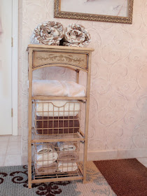
I like to roll towels in a bathroom. It gives than spa-like look and feel to the space. I also love candles.
I found this clock at Michaels on clearance. It was the perfect colors and look for the bathroom.
I have a thing for glass jars filled with soaps and bath salts and other "stuff" on a bathroom vanity. These are a recent addition I picked up at Home Goods for a great deal (they were $12.99 and $14.99 respectively but I had a gift card so I didn't cost me a thing).
I like the look of the faucet with the hot/cold on it.
The tower is from Fortunoff.
The rug is from Target and pulled together all of the new colors for the bathroom.
Let me know what you think about this space. I always love and appreciate your comments.
Don't forget the Winter Blues party is still going on. Click here to join in the fun. The link will be open through Friday.
-Judy


I love your vanity. Wonderful room!
ReplyDeleteI love what you've done. We're headed for a bathroom re-do one of these days. The bathtub will stay - it's a treat! The shower needs to be replaced and we'll install a bigger one. Like you, I have a large, unframed mirror in the bathroom. I don't want to lose the wonderful reflected light, so will probably just frame it with molding.
ReplyDeleteIt's beautiful Judy! I'm like you in that I like my master bathroom to be more neutral, calm and serene with just hints of color here and there. My favorite part is that gorgeous vanity table and chair! :-)
ReplyDeleteVanessa
Very nice! Love that vanity. We moved into this house last Spring and I am itching to makeover the master bath. There is plenty of room in there but for some reason the people who built the house decided not to put a tub in it and I am a big bath person! A claw foot tub is at the top of my wish list.
ReplyDeleteThanks for sharing. :)
Such a lovely bathroom! I am in need of a master bath redo! LOL
ReplyDeleteIt's really pretty, love the color combo,
ReplyDeleteLove the look of your bathroom and how wonderful to have so much space. Your decor is gorgeous. Hugs, Marty
ReplyDeleteRod has agreed to a master bath remodel, and I can hardly wait! We both want a bigger shower. Ours was designed for skinny people!
ReplyDeleteSuch an inviting bathroom. And I LOVE the colors.
ReplyDelete=)
Very pretty and I love the rug to compliment it all!
ReplyDeletelooks great, love the colors, my party is still going on if you want to share this.
ReplyDeletehttp://typeadecorating.blogspot.com/2011/02/anything-goes-party-4.html
Beautiful job!!!
ReplyDeleteJust beautiful!
ReplyDeleteHow lucky to have such a huge bathroom. I love what you've done with it.
ReplyDeleteLooks beautiful! I love the brown and blue combination. Thanks for linking up!
ReplyDeleteWhat a gorgeous room.
ReplyDeleteI am your newest follower!!! Gorgeous bathroom. Can't wait to poke around here!!!
ReplyDeleteI love that faucet! I've been looking at a million faucets lately! Great job!
ReplyDeletecreative.
ReplyDeletethanks for sharing.
:)
Hi there, Thanks so much for stopping by my blog. I can't wait to share some great ideas with you. Also, I just love your book ends that you made for your Daughter. Too cute!! Johnnie
ReplyDeleteBeautiful Room! The colors are so soothing and spa-like. Love the Left Bank Clock and how you've displayed your utilitarian stuff in such a pretty way! Thanks for sharing.
ReplyDeleteHello again, I just liked you on your Facebook. Hope you will do the same for me. I also forgot to tell you earlier that I love the colors in your bathroom and I adore your vanity. Very pretty! My next project is revamping my master bath and bedroom. Thanks for the inspiration. See you soon!! Johnnie
ReplyDeleteHi, thanks so much for stopping by my blog and for your lovely comment. Im in awe of your bathroom!! Its huge and so well decorated - you wouldnt be able to get me out of there :o) Scarlett x
ReplyDeleteVery pretty--looks like a relaxing spa! Thanks for linking up to Beyond The Picking Fence.
ReplyDeleteWhat a delicious color scheme.
ReplyDeleteI really enjoyed this tranquil little stop on our journey through Alphabe-Thursday's letter "S".
You are really a superb decorator.
Thank you for linking.
A+
You have a lovely big bathroom! I like your choice of colours. They are gentle and relaxing; just how a bathroom should be!
ReplyDeletemmmm I love the soothing color scheme here - lovely lovely lovely!
ReplyDeleteI mentioned this post on my blog today! http://mallicious.blogspot.com/2011/02/new-faucets.html
ReplyDeleteHope you have a great day!
Frameless shower doors are really popular in contemporary bathrooms, with their sleek, modern look. The shower door hardware can be mounted straight onto the glass, for a smart and tidy finish.
ReplyDeleteSeeing your bathroom has made me much happier about the colors I have chosen for my new house. I have gone back and forth about changing. Your bathroom is gorgeous!!!
ReplyDelete